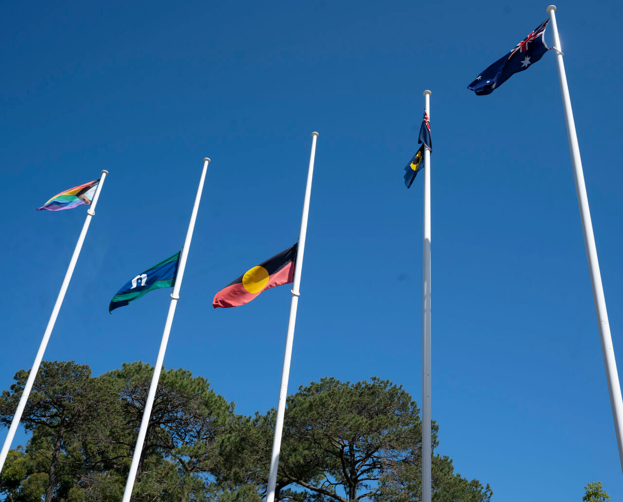
Murdoch University Flags flying at half mast

Murawin Statement on The Referendum Result

Oct 20, 2023

In the devastating wake of last week’s referendum result, the resounding ‘No’ vote against recognising Indigenous Australians as the First Peoples of this land and taking their rightful place in the National Constitution reverberates through our nation and through our team here at Murawin.  

We took the time this week to honour the request for silence and as we paused, reflected, and openly acknowledged the profound hurt and impact this decision has had, both in our communities and within our team, we are committed even more to work for social justice for First Nations peoples throughout this country. 

With utmost sincerity, we convey the emotions that resonate through our team:

Disbelief. Hurt. Difficult.
Despair. Hopelessness. Devastated.
Sadness. It’s incredibly personal.
Heavy hearted. Confronting.
 

As an Indigenous-owned and led company, we are family, and these are the sentiments that echo through Murawin’s team in response to the referendum outcome. 
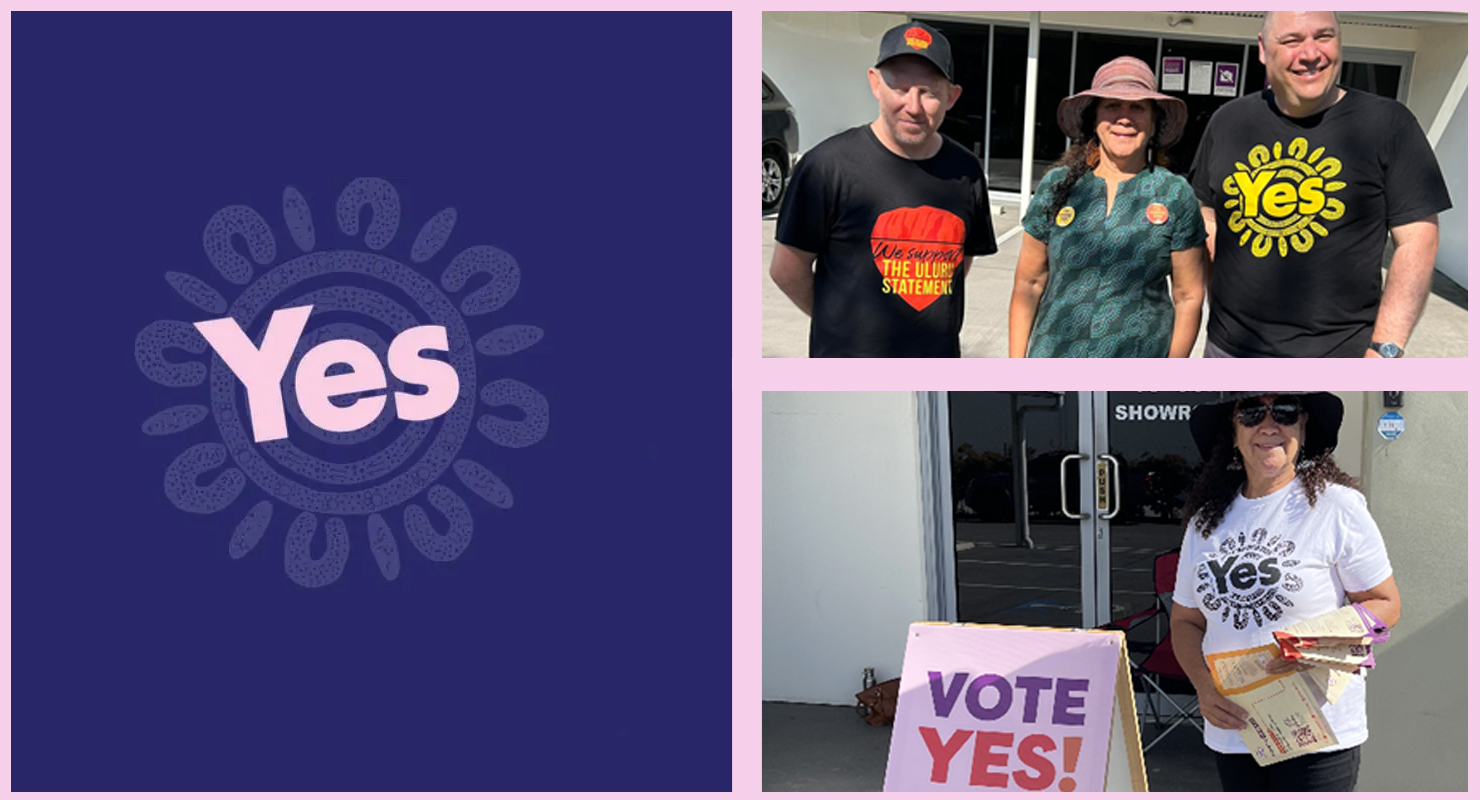
Carol Vale campaigning for YES23

In this pivotal moment, we prioritise the well-being of our staff. We stand together, engaging in open conversations, acknowledging the painful truths, and sharing this collective burden. We are also carving out time to replenish our spirits and be with Country. 

As we take the time to replenish, we publicly recognise and thank our dedicated staff. We acknowledge the exceptional efforts that each of them invest in their work, and we honour the cultural responsibility each of them carries, representing not only an Indigenous-owned and led company, but one that fervently advocates for the integration and privileging of voices of First Nations peoples through the work that we do. Our gratitude knows no bounds for all that our staff contribute to Murawin, our clients, and our communities. 

Whilst the weight of the referendum result sinks, the broader future remains uncertain. But there are four things that we know are certain within Murawin: 

      1. The work catalysed by #YES23 is far from over; it remains our ongoing commitment and we have much work to do.

      2. Our despair will give way to renewed determination, propelling us forward. Our next push will come.

      3. At our core, an unwavering passion to drive change burns brightly, extending beyond Indigenous Australians to all marginalised groups.

      4. We stand firm in our cultural and professional integrity, and will challenge our clients, communities, and peers with cultural reason, logic, and respect. 

In these trying times, Murawin extends our heartfelt support to all within our network who are grappling with the pain of this moment. We see you, we respect your resilience, and we encourage you to pause, rejuvenate, and heal where you can. When the time is right, we will reconnect and together we will create impact. 

#YES23

Banner Image Credit: Murdoch University (17 October 2023) ‘In response to the call by Indigenous leaders who fought…’ [LinkedIn], accessed 19 October 2023. https://www.linkedin.com/school/murdoch-university/posts/?feedView=all

BACKGROUND

Murawin, is a Dunghutti word which means “to be educated, and to be responsible with that education.”

It is about not only having the knowledge but knowing what to do with it and passing it on when the time is right. Education has always been a passion for both our co-founders and is at the heart of Murawin’s work facilitating intercultural learning, respect & collaboration.


Our logo is also steeped in meaning and symbolism,

merging professionalism with a contemporary flair while staying rooted in Country through stylised elements of waterways and river rocks. These elements, symbolising life, healing, and reconciliation in Indigenous culture, resonate with Murawin’s client-focused approach.

Originating from river Country in regional NSW, Murawin’s founders’ childhood experiences shaped the logo’s significance, reflecting their deep ties to family and Country. The river rocks signify Murawin’s enduring connection to Country and culture, chosen for their symbolism of strength and resilience akin to Aboriginal and Torres Strait Islander cultures. They also represent Murawin’s commitment to positive impact and intergenerational change. Notably, the eight rocks symbolise cofounder Carol Vale’s immediate family members, while the two lines in the logo signify the intertwining of cultures by our two co-founders, Carol and Greg.

VISUAL INDENTITY UPDATE

What we wanted to do was to better reflect Murawin’s story, goals, mission and values through a supporting look and feel that elevated our branding and centred Country, our story and our values.

To do this we started with an updated colour palette.

We wanted a natural colour palette that reflects Country

and gives people a calm and clear perspective just like when time is spent on Country. Simultaneously we wanted it to reflect the professional, rigorous and forward-thinking nature of our work.

Each colour had to be meaningful and tied to Murawin’s story, so we pulled the colours directly from images of Country in areas important to Murawin and its co-founders.

Wollomombi - brand colour

Meaning “the meeting of two water ways”, Wollomombi Falls sits almost side by side with Chandler falls just outside of Armidale. The two rivers come together at the bottom of the waterfalls to become one. It represents our co-founders coming together to form Murawin

Riverbank - primary colour

Represents the banks of the Macquarie River (and other key riverways important to Murawin’s story such as the Macleay)

Peppermint Gum - primary colour

Whenever visiting Armidale, Murawin’s co-founders would collect Peppermint Gum leaves.

Red River Gum - primary colour

Red river gum trees are a favourite tree of both Murawin’s co-founders

Darling River - secondary colour

The Darling River at Bourke is another important river in the Murawin story.

Gara Granite - secondary colour

The Gara River / Blue Hole is a special place to Carol’s family- they would visit a lot growing up

Bourke Sunset - secondary colour

This colour was pulled directly from a photo of a Bourke Sunset taken by our late co-founder Greg McKenzie

Another key piece we have woven throughout this new visual identity is the contrasting black and white to visually represent the intercultural nature of our work and our story.

This duality is an important feature in Murawin’s story and in our work as the conduit between clients and communities.

This colour palette intertwined with artistic elements and the Country-centric imagery that you see throughout our website, reinforces that Country, community and culture are at the heart of everything we do at Murawin.

We are proud to present this new visual identity to the public, our clients, and the communities we work with to better reflect our story, the work we do, and our vision for the future.