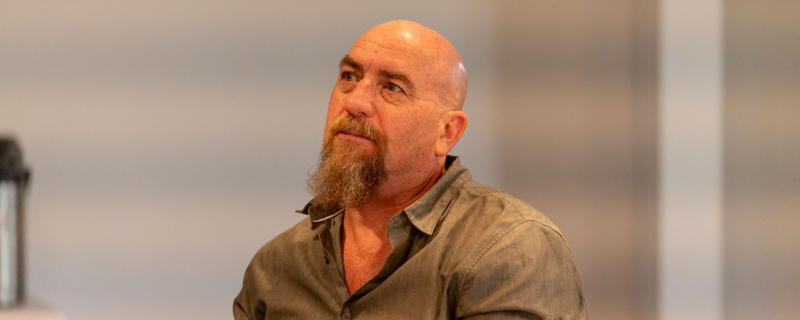
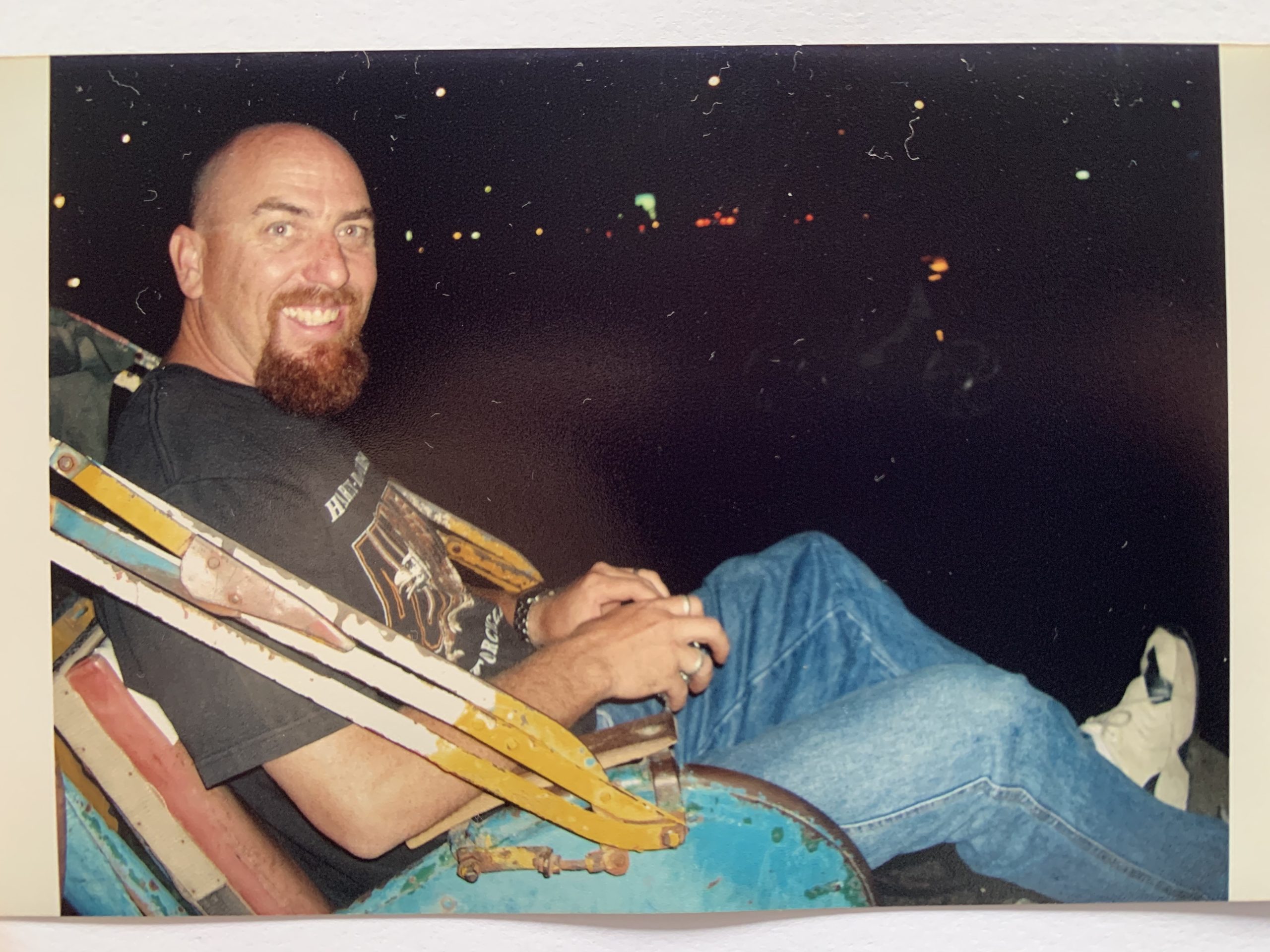
Today we honour Greg

Feb 19, 2024

Today marks the one-year anniversary of the passing of Murawin’s Co-Founder, Greg McKenzie.

“Greg was not just my business partner, he was my life partner. So let me first acknowledge my co-founder, my darling Greg, my rock. Let me acknowledge that he is the other half of Murawin and everything about Murawin is informed by both of our values.”
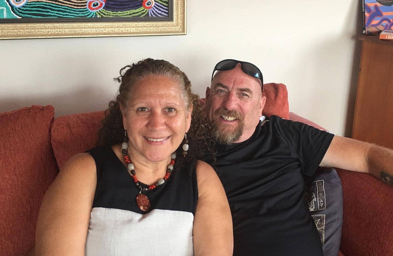
His ever-present legacy continues through his family, his business, and his friends.

It’s very sad, very sad that he’s not here to share this year. He’s not here physically, but he will always be with me spiritually.  
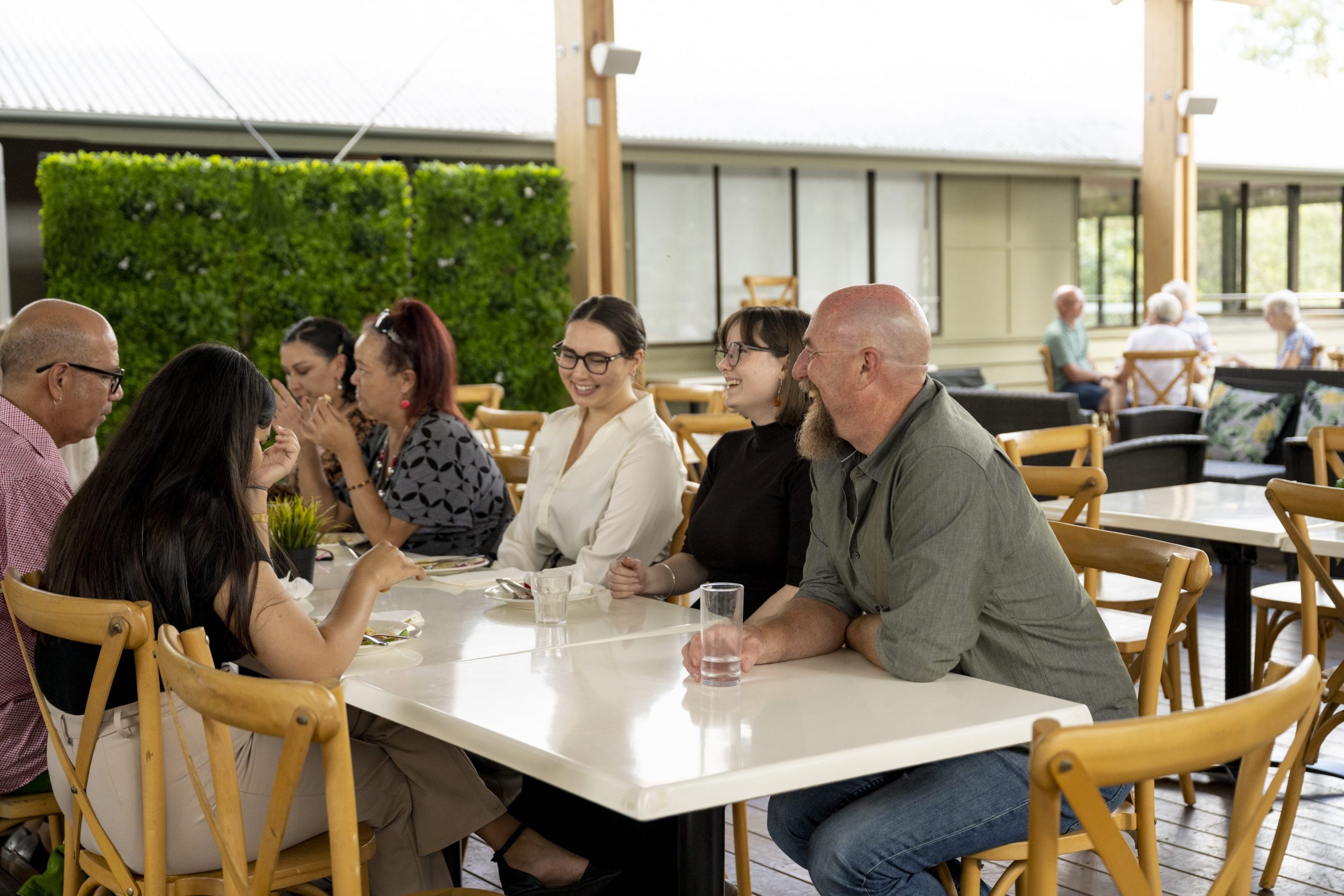
 

As part of our business model, we incorporated yarning circles, which were about how to manage loss and grief, in a corporate context, where people were able to deal with their own loss because it wasn’t just my loss.
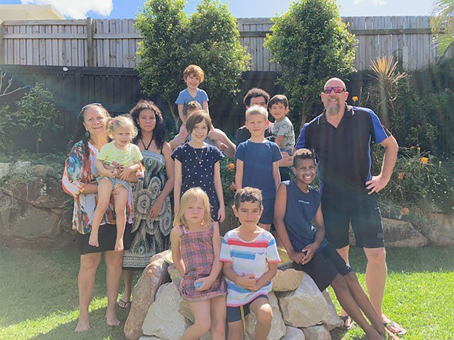
A true leader, advocate, ally, and kind visionary. Today we honour Greg and the formidable way he dedicated his life to creating impact.

My final piece is that Murawin is Greg and I. It is us coming together as Indigenous and non-Indigenous and it showcases the commitment, the dedication, and the love that we have for each other, but also for wanting to improve outcomes for others.”

Murawin thanks you all for your support over this challenging year and our thoughts are with Greg’s family and community during this challenging milestone.
BACKGROUND

Murawin, is a Dunghutti word which means “to be educated, and to be responsible with that education.”

It is about not only having the knowledge but knowing what to do with it and passing it on when the time is right. Education has always been a passion for both our co-founders and is at the heart of Murawin’s work facilitating intercultural learning, respect & collaboration.


Our logo is also steeped in meaning and symbolism,

merging professionalism with a contemporary flair while staying rooted in Country through stylised elements of waterways and river rocks. These elements, symbolising life, healing, and reconciliation in Indigenous culture, resonate with Murawin’s client-focused approach.

Originating from river Country in regional NSW, Murawin’s founders’ childhood experiences shaped the logo’s significance, reflecting their deep ties to family and Country. The river rocks signify Murawin’s enduring connection to Country and culture, chosen for their symbolism of strength and resilience akin to Aboriginal and Torres Strait Islander cultures. They also represent Murawin’s commitment to positive impact and intergenerational change. Notably, the eight rocks symbolise cofounder Carol Vale’s immediate family members, while the two lines in the logo signify the intertwining of cultures by our two co-founders, Carol and Greg.

VISUAL INDENTITY UPDATE

What we wanted to do was to better reflect Murawin’s story, goals, mission and values through a supporting look and feel that elevated our branding and centred Country, our story and our values.

To do this we started with an updated colour palette.

We wanted a natural colour palette that reflects Country

and gives people a calm and clear perspective just like when time is spent on Country. Simultaneously we wanted it to reflect the professional, rigorous and forward-thinking nature of our work.

Each colour had to be meaningful and tied to Murawin’s story, so we pulled the colours directly from images of Country in areas important to Murawin and its co-founders.

Wollomombi - brand colour

Meaning “the meeting of two water ways”, Wollomombi Falls sits almost side by side with Chandler falls just outside of Armidale. The two rivers come together at the bottom of the waterfalls to become one. It represents our co-founders coming together to form Murawin

Riverbank - primary colour

Represents the banks of the Macquarie River (and other key riverways important to Murawin’s story such as the Macleay)

Peppermint Gum - primary colour

Whenever visiting Armidale, Murawin’s co-founders would collect Peppermint Gum leaves.

Red River Gum - primary colour

Red river gum trees are a favourite tree of both Murawin’s co-founders

Darling River - secondary colour

The Darling River at Bourke is another important river in the Murawin story.

Gara Granite - secondary colour

The Gara River / Blue Hole is a special place to Carol’s family- they would visit a lot growing up

Bourke Sunset - secondary colour

This colour was pulled directly from a photo of a Bourke Sunset taken by our late co-founder Greg McKenzie

Another key piece we have woven throughout this new visual identity is the contrasting black and white to visually represent the intercultural nature of our work and our story.

This duality is an important feature in Murawin’s story and in our work as the conduit between clients and communities.

This colour palette intertwined with artistic elements and the Country-centric imagery that you see throughout our website, reinforces that Country, community and culture are at the heart of everything we do at Murawin.

We are proud to present this new visual identity to the public, our clients, and the communities we work with to better reflect our story, the work we do, and our vision for the future.